FLYING TOASTER KNIGHT FTW
Tuesday, May 10, 2011
Thursday, May 5, 2011
InDesign Projects 2011
Project 1: Introduction
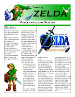
Since many people haven't used InDesign, our introduction assignment was to create a simple flyer about something that was interesting to us. We had to create a title and add some pictures and text using the box tools.


Project 2: 4-Page Book
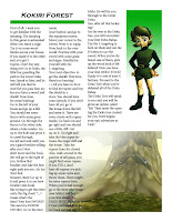
For Project 2 we had to create a 4 page book-like thing. We had to create the header logo in Illustrator and Photoshop, then import it into InDesign. Then, we had to arrange the pictures and text in a way that was appealing for all the pages.
Project 3: Columns and Pictures
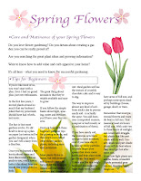
We were supposed to create a flyer-type poster with a cover. We had to use the columns to separate text and pictures from an ad selling a product. I can't seem to find the file on my computer, so I'll post it when I find it.
Project Final: Full-Length Booklet
For the final we had to pick a band or a graphic artist, and design a booklet around them. For mine, I chose a type of a band. We had to create the cover and find the graphics, as well as create one our own. Then, we had to add 2,500 words worth of text around pictures, and still make it visually pleasing. There are some errors because I had used Photoshop for some of the picture printing and InDesign for the words on certain pages. I may or may not post a Photoshop version of some of the pages.
Illustrator Projects 2011
Illustrator Practice 1: Farm Animals
This is simply just some practice using Illustrator. Used the pen tool with fills.
Illustrator Practice 2: Dragon
More practice using Illustrator. This time a dragon, using the same techniques as the previous.
Illustrator Project 1: Logo Design
For this project as our introduction to Illustrator, we were to use the pen tool and fill tools to create a logo for a fake company. I used line and stroke to create the image then off centered the colors for added effect. Not too happy with the colors but I did like the linework.
Illustrator Project 2: Lineart Import
Here, we had to import lineart we had drawn by had and use a live trace on it. I once again chose a phoenix, then added some cool line effects for a background to make it more lively.
Illustrator Project 3: Magazine Cover
We had to use different techniques we had gathered to create a magazine cover. I used a live trace on the picture and created some of the graphics. I also used color themes for impact.
Illustrator Final: Large Poster
For the final, we were to choose something like a video game and create a poster-sized advertisement for it using Illustrator. At least one of the objects had to be a live-traced picture that we either drew for found. We were also to create at least of the objects.
Photoshop Assignments 2011
Photoshop Assignment 1: Collage
wand tool.
Photoshop Assignment 2: Soviet-Style Poster
This project was meant to mimic the style of old Soviet propaganda posters. So we had to use sharp angles and bold blocks of colors. Textures were to be used as well as some filters, like the Photo Filter.
Photoshop Assignment 3: Movie Poster
For this assignment, we had to create a B-Movie poster based on different techniques we had previously learned. We had to start with a background image, come up with a title, and add characters to the image to create a scene about what the movie was to be about. I chose bunnies because bun-buns are awesome.
Photoshop Assignment 4: Book Cover
Here we had to use a lens flare as our main technique. The image was to create a cover for a book, using a bronze-colored object and applying the lens flare to it to create that "shiny" effect.
Photoshop Final 1: Rosy Dragon
For the final, we had to use all the techniques we had learned throughout the class and apply it to the final. We also had to use a drawing we created ourselves. So, I made a dragon, colored in in Photoshop and added a flowery background.
Photoshop Final 2: Sweet and Sorrow Song
For this part of my final i collaged together something on a theme of 'song.' I used filters and layering to my advantage, as well as color. I also placed some text for added effect.
Photoshop Special: Whut?
An unused work for my final. It's a picture consisting of a bunch of random images for a funny effect. I still don't understand it.
Subscribe to:
Comments (Atom)


